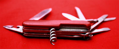
At some point or another, if you want to lay out a complex CSS design, you’re probably going to have to turn to the veritable Swiss Army knife of advanced CSS layout: the position property. There are four possible values for this property: static, relative, absolute, and fixed. Let’s briefly go through each.
The static position value is sort of like the giant oversized flathead screwdriver in the Swiss Army knife: initially, it really doesn’t look like it does much at all. That’s because all objects are “static” positioned by default. Therefore, if you whip out a “static” position on an object that doesn’t have anything else applied, you can expect it to do… absolutely nothing. However, it can be useful if, for example, you’ve set a “relative” position on every image in your website, and then you need on specific image to behave normally. That’s when you suddenly realize that the giant flathead screwdriver is exactly the right size for replacing the screws on the bathroom vent cover. It has finally earned its keep.
Relative positioning in CSS is a bit like the pair of scissors in a Swiss Army knife: it has a pretty obvious function, but it doesn’t always work as well as you’d expect (or at least, it doesn’t the same way as you’d expect). Using the relative position value, in conjunction with the top, bottom, left, or right properties to move the object, moves an object from its initial location in the document flow to a new one. However, the old space where the object used to live is left open. Therefore, if you have three paragraphs, and position the third paragraph like so:
p#two {
	position: relative;
	top: 2em;
	right: 3em; }
Then you’d end up with a document that looked something like this (I’ve added some styling to the paragraphs to make the positioning easier to see). As you can see, the paragraph as moved down and left (or more accurately, away from the top and right) from where it was originally, but the space reserved for the paragraph has remained intact. This can be useful, as long as you understand what you’re getting when you relatively position. It’s like understanding that the scissors in your knife are okay at cutting fabric in an emergency, but they’re never going to replace your kitchen shears.
Absolute positioning is the knife of the Swiss Army knife: it’s what everyone generally thinks of (and expects) when they think of positioning elements. Absolute positioning an element pulls it completely out of the document’s flow – the space it would have otherwise occupied is closed up, and the element is placed wherever you’d like it to be placed (according to the top/right/bottom/left properties). So this little bit of code:
p#two {
	position: absolute;
	bottom: 2px; }
Will result in something like this. Note a few things about this example: first, since we set the “bottom” property the element is positioned according to the bottom of the browser window (and
And last but certainly not least is the fixed position property. It’s a little like that slightly sharp, oddly curved piece of metal in your Swiss Army knife – you’re not quite sure what to do with it at first, but once you realize it’s perfect for popping the top off a beer bottle, it quickly becomes your favorite tool in the arsenal. Fixed positioning behaves a little like absolute: it pulls the element out of the document flow and closes the original space behind it. However, unlike absolute positioning, once you’ve specified a spot for the element, it stays there… even if the page behind it moves. So take this code:
p#two {
	position: fixed;
	top: 10em;
	width: 35em;
	background-color: #fcc; }
That will produce a document that behaves like this. No matter how much you scroll, that paragraph will stay in the exact same spot. This can be really useful if you need something to always stay in one spot, like an important navigation bar at the top of the page, or footer information that you always want to be visible at the bottom of the window.
Once you learn to master these properties, advanced CSS layouts start to become a whole heck of a lot less mysterious. If you’d like to learn more, be sure to subscribe to the CSSnewbie RSS feed, because later this week I’ll be talking more about how to use these properties in useful and interesting ways.
