
Everyone loves to visit a responsive site which appears to be alive. CSS hover effects helps developers to do just that. It allows users to easily animate the images or texts of a website, making them more dynamic in appearance and it is supported by all browsers as well.
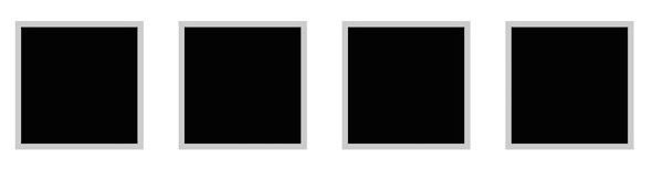
1. Bump Up
One of the coolest CSS hover effects which plays best with a set of similar horizontal images, Bump Up creates the illusion of a wave with images when set side by side. Just move the mouse over the line of images and it will bob up and down, giving users the feel of something floating on water. Bump Up can be done easily by starting off with a particular margin size and reducing it on hover.
Using transition to bring out the effect further smooths it down, however, this can be avoided and depends on what you choose. The same effect can also be done on texts, provided they are listed.
Code : .ex1 img{ border: 5px solid #ccc; float: left; margin: 15px; -webkit-transition: margin 0.5s ease-out; -moz-transition: margin 0.5s ease-out; -o-transition: margin 0.5s ease-out; } .ex1 img:hover { margin-top: 2px; }
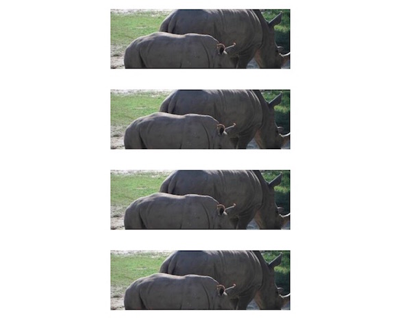
2. Stack & Grow
Stack & Grow takes the vertical approach while creating a wavy effect making it look like the liquid in lava lamps. This effect is super easy to achieve. Choose similar images and stack them up vertically. Make sure they have different marginal areas.
Once they are stacked up, simply expand them on hover and voila! The cool lava lamp effect is achieved. The expansion sometimes changes the alignment of the images which can be recreated by the use of negative scaling. Usually scaling the margin to half of the original on the negative side restores the alignment.
Code : /*Example 2*/ #container { width: 300px; margin: 0 auto; } #ex2 img{ height: 100px; width: 300px; margin: 15px 0; -webkit-transition: all 1s ease; -moz-transition: all 1s ease; -o-transition: all 1s ease; } #ex2 img:hover { height: 133px; width: 400px; margin-left: -50px; }
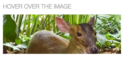
3. Fade Text in
Want something magical? Where things appear out of nowhere when you touch or click certain parts? Wouldn’t it be cool if you could do the same on your website too? Like making some text or image appear out of the blank when you click certain other part of the website? It can be done the help of Fade Text in. This awesome CSS hover effect is simple to create and allows text to appear on the screen.
All you need to do is insert the text, convert the color of the text to transparent and the height of the line to 0px which will make it vanish. Then change the color and height when on hover. This will make the text reappear when you hover your mouse over the image.
Code : #ex3 { width: 730px; height: 133px; line-height: 0px; color: transparent; font-size: 50px; font-family: “HelveticaNeue-Light”, “Helvetica Neue Light”, “Helvetica Neue”, Helvetica, Arial, sans-serif; font-weight: 300; text-transform: uppercase; -webkit-transition: all 0.5s ease; -moz-transition: all 0.5s ease; -o-transition: all 0.5s ease; } #ex3:hover { line-height: 133px; color: #575858; } #ex3 img{ float: left; margin: 0 15px; }
4. Crooked Photo
This effect is a great choice for the display of thumbnails. When there are many images displayed as a thumbnail on a website, just hover on a particular one and it would appear like a crooked wall hanging which will grab the viewer’s attention.
The crooked photo effect can be achieved by the use of transitions (optional) and it also gives users the liberty to play around with it. Designers can change the direction of leaning of images with the aid of pseudo selectors.
Code : #ex4 { width: 800px; margin: 0 auto; } #ex4 img { margin: 20px; border: 5px solid #eee; -webkit-box-shadow: 4px 4px 4px rgba(0,0,0,0.2); -moz-box-shadow: 4px 4px 4px rgba(0,0,0,0.2); box-shadow: 4px 4px 4px rgba(0,0,0,0.2); -webkit-transition: all 0.5s ease-out; -moz-transition: all 0.5s ease; -o-transition: all 0.5s ease; } #ex4 img:hover { -webkit-transform: rotate(-7deg); -moz-transform: rotate(-7deg); -o-transform: rotate(-7deg); }
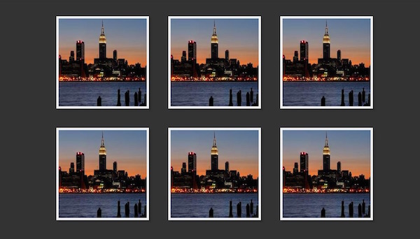
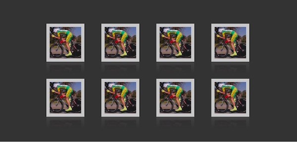
5. Fade In and Reflect
Ok! So we have saved the most complicated one for the last. This CSS hover effect is a bit tough to achieve, but it looks so amazing that it is worth the hard work. If you have images which are formed in the thumbnail formation, you need to reduce the opacity of all the images at large. When you hover over to a particular image, the opacity regains its normal value and the image appears brighter than the surrounding.
It is further enhanced by the reflection that is formed at the bottom of the image. The reflection, however, does not respond to the transition and which leaves little room for customization.
Code : #ex5 { width: 700px; margin: 0 auto; min-height: 300px; } #ex5 img { margin: 25px; opacity: 0.8; border: 10px solid #eee; /*Transition*/ -webkit-transition: all 0.5s ease; -moz-transition: all 0.5s ease; -o-transition: all 0.5s ease; /*Reflection*/ -webkit-box-reflect: below 0px -webkit-gradient(linear, left top, left bottom, from(transparent), color-stop(.7, transparent), to(rgba(0,0,0,0.1))); } #ex5 img:hover { opacity: 1; /*Reflection*/ -webkit-box-reflect: below 0px -webkit-gradient(linear, left top, left bottom, from(transparent), color-stop(.7, transparent), to(rgba(0,0,0,0.4))); /*Glow*/ -webkit-box-shadow: 0px 0px 20px rgba(255,255,255,0.8); -moz-box-shadow: 0px 0px 20px rgba(255,255,255,0.8); box-shadow: 0px 0px 20px rgba(255,255,255,0.8); }
Article Source : DesignShack