
If you work with CSS a lot, and especially if you work with a lot of responsive and mobile friendly designs, then you probably know the difference between pixels and ems. But just in case, here’s a little rundown for you: pixels are fixed values of measurement that can be used to define the size of a number of different HTML elements. Pixels can be used to define the size of a font, or the width and height of a div, for example. But when you define size using pixels, that size is static, so a div that is 500px wide will display at that size regardless of whether or not it’s viewed on a desktop or a mobile device (most of which are smaller than 500px wide).
Ems, on the other hand, are scalable units of measurement. An em is equal to the current font size, so they’re a lot easier to use to control the size of elements based on the viewport. If the width of a div is always 10em, then all you have to do is change the font size of the body of the web page and the div’s width will change accordingly. This makes it a lot easier to change sizes of elements based of viewport size, because you only have to change the size of one element (font-size) to change them all.
But for a lot of designers and developers, pixels is how they learned and what they’re used to. If that’s the case, then you’re in luck — there are pixel to em converters that can be used so you know exactly how many ems to make an element! Check out the list of some of the best converters below.
1. Px to Em
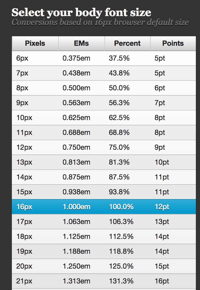
Px to Em provides you with handy reference tables that reveal conversion rates based on the base font size. If you don’t feel like looking it up, you can also just enter all the information into their converter and you’ll be presented with your custom conversion.
2. W3 Schools

Another great way to convert, this converter takes all the guess work away and doesn’t provide tables or charts. Simply enter in your default pixel size (FYI, on most browsers this is 16px, but if you’ve changed it to something different using CSS, be sure to account for that), and the px or em that you’d like to convert to the other unit of measurement. This converter does px to em and vice versa, so you’ve got all your bases covered.
3. Em to Px

This is another great converter application that just about achieves the same effect as the other two on this list, but it has a really clean design and is very straightforward and easy to use.
No matter which converter you use to go between px and em, your responsive designs will thank you, and so will your schedule. You’ll definitely notice less time spent on responsive styling if you switch from fixed pixel units of measurements to scalable, mobile-freindly ems.